Amelia
The Story
Amelia is a refined jewelry brand built around timeless pieces designed to complement everyday style. Founded with a focus on understated beauty, the collection moves beyond seasonal trends to offer elegant designs that feel modern, versatile and enduring. The brand needed an identity that could reflect the quality and delicacy of the jewelry while creating a polished presence across packaging, print and customer touchpoints.
The Challenge
The challenge was to communicate elegance without making the brand feel overly traditional or delicate. Amelia Jewelry needed to feel sophisticated and feminine while still appealing to a modern customer looking for pieces that can be worn every day. The identity also had to create a cohesive foundation for the full retail experience, from the first impression of the brand to the moment each piece is received.
The Creative Direction
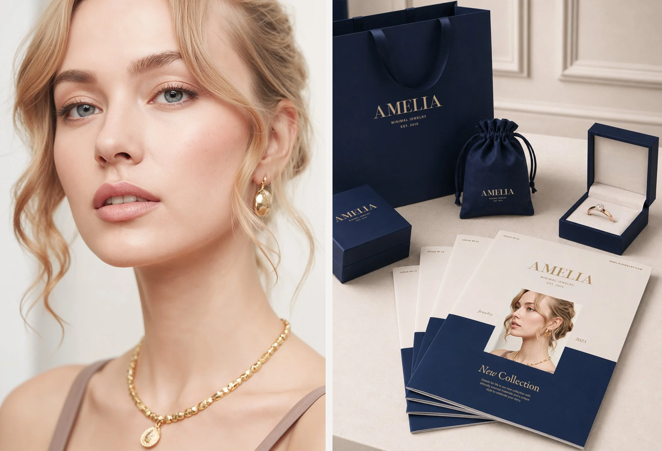
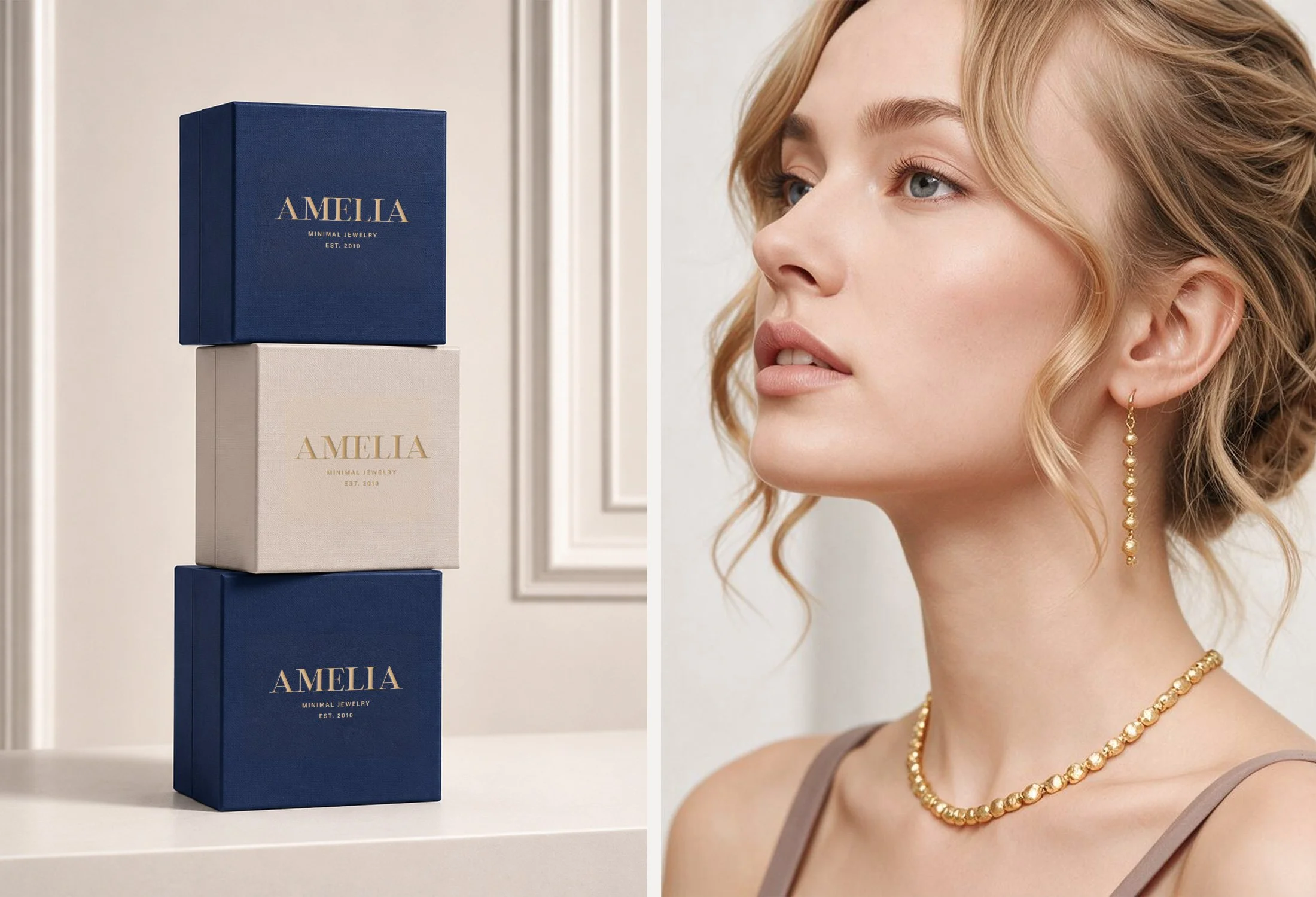
The visual identity was shaped around restraint, warmth and timeless sophistication. A soft, refined color palette introduces femininity without feeling overly sweet, while clean typography gives the brand a confident and contemporary foundation.
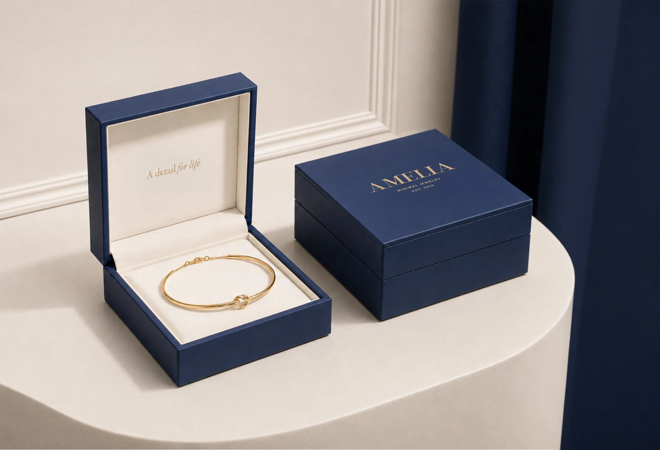
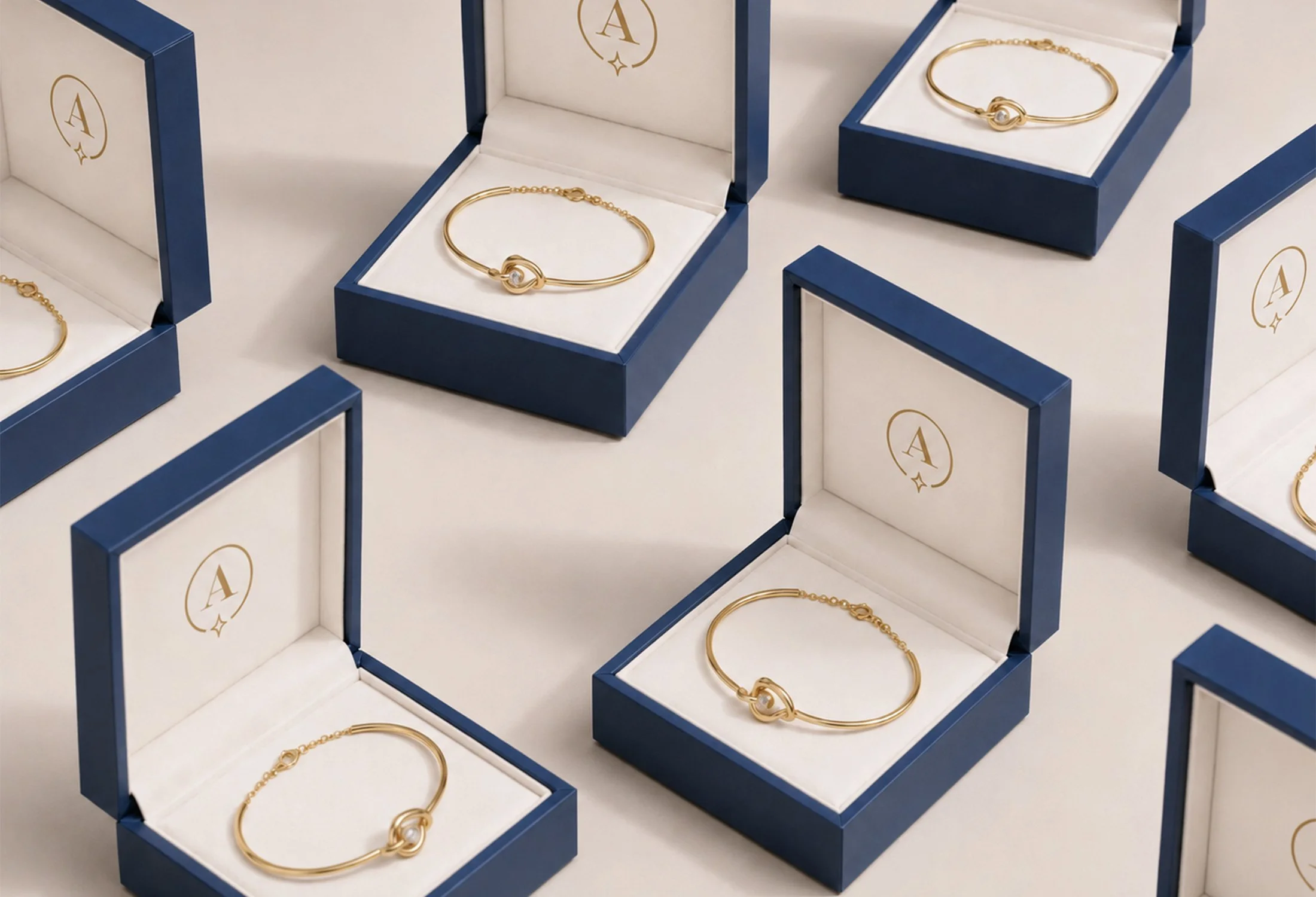
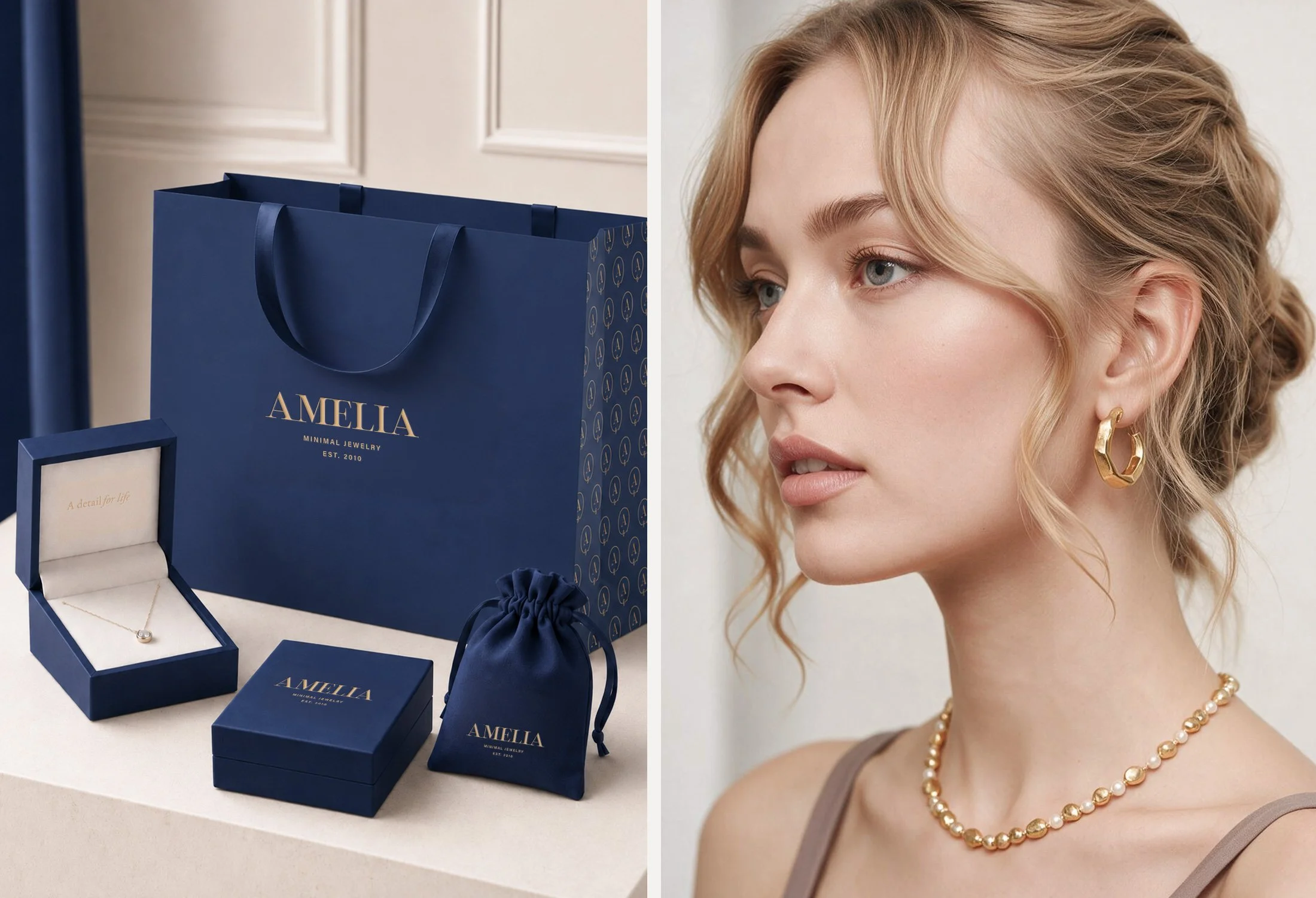
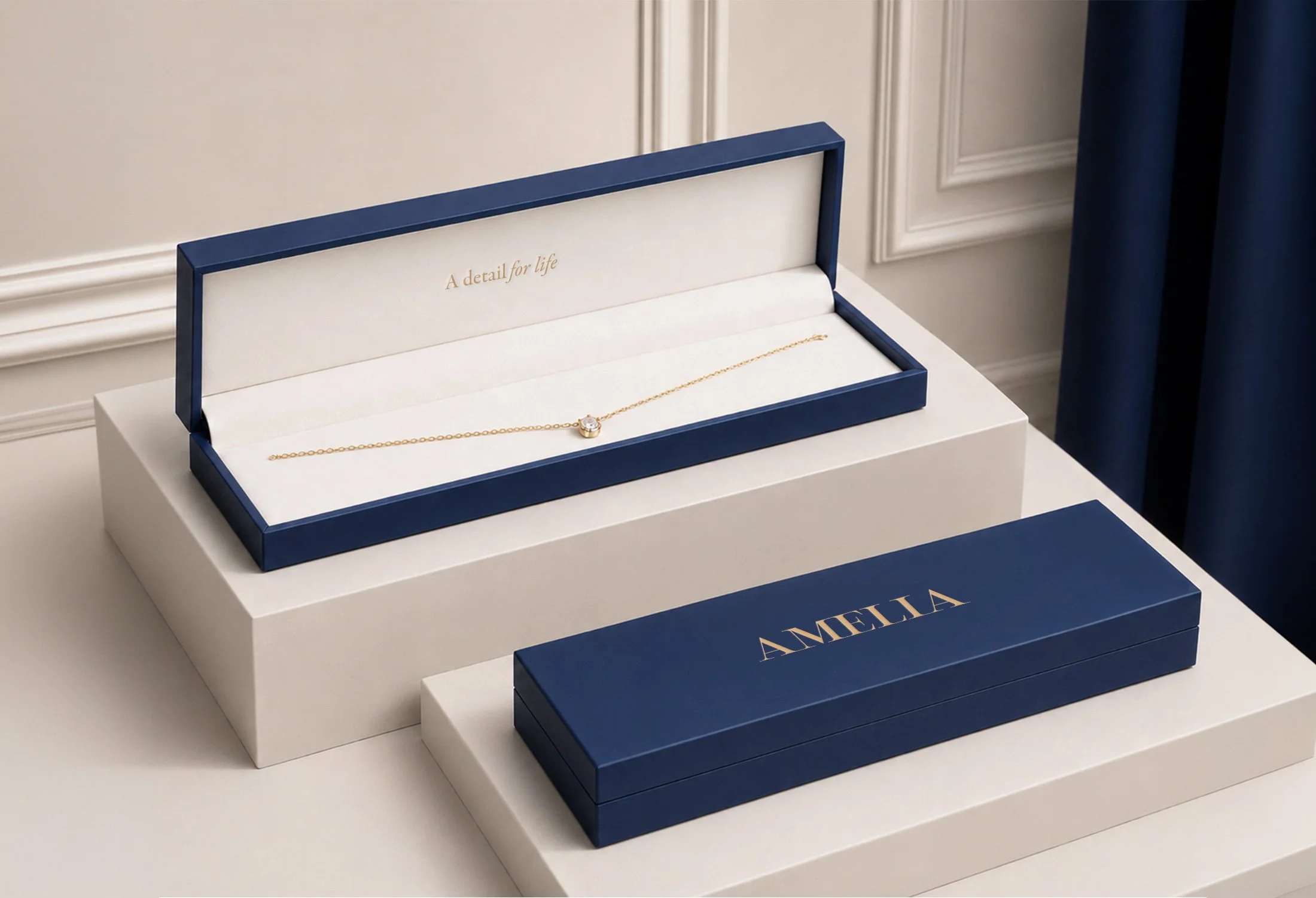
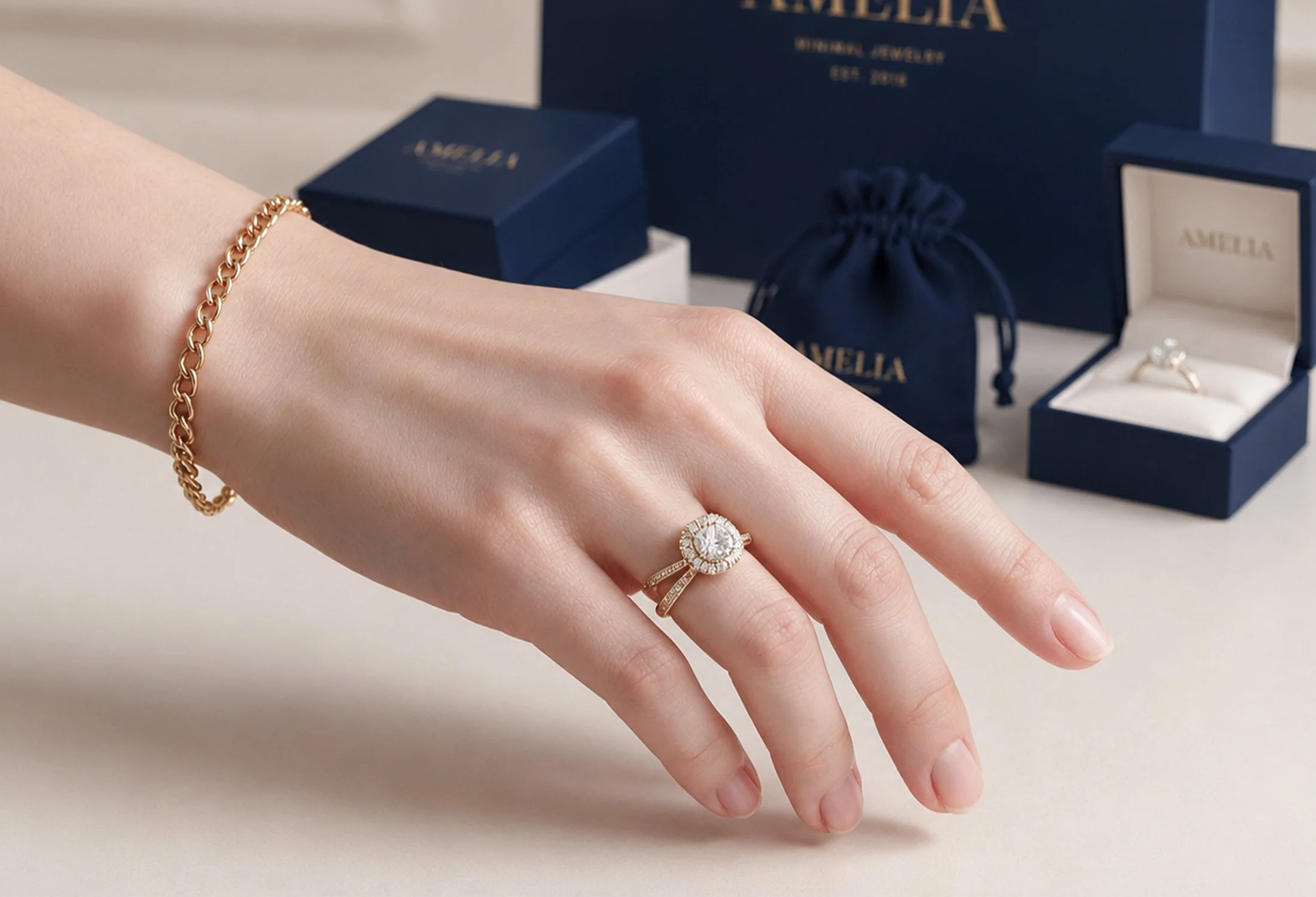
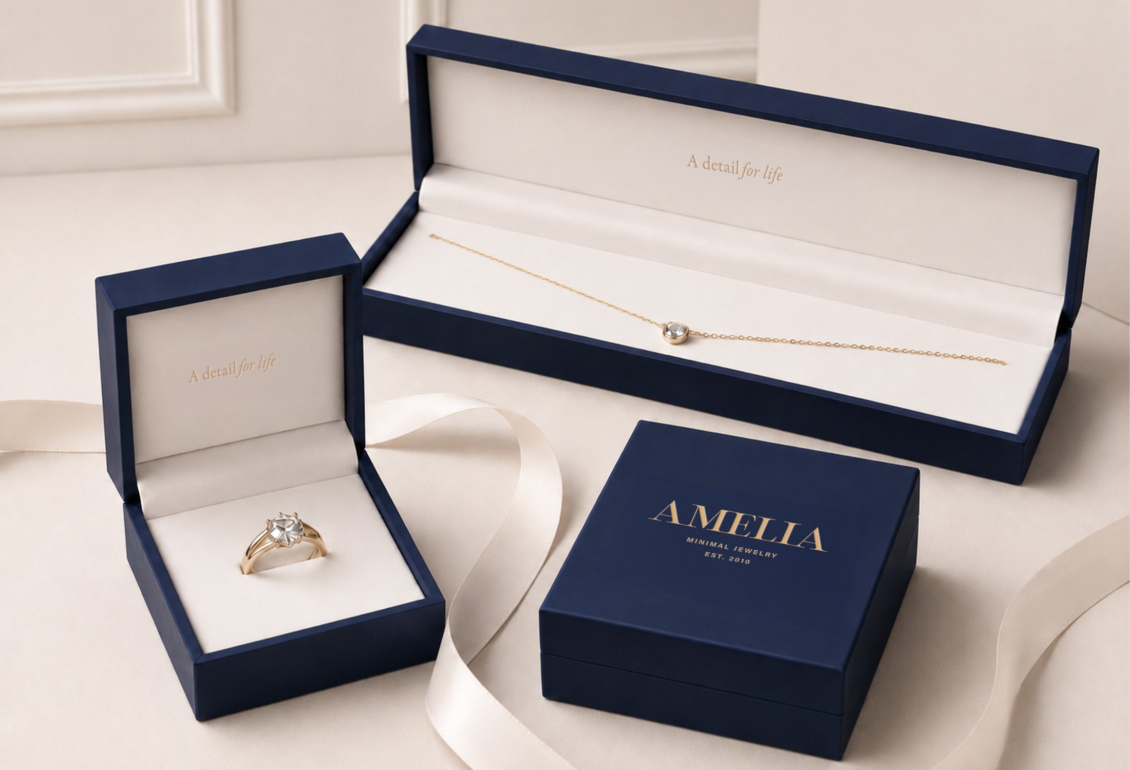
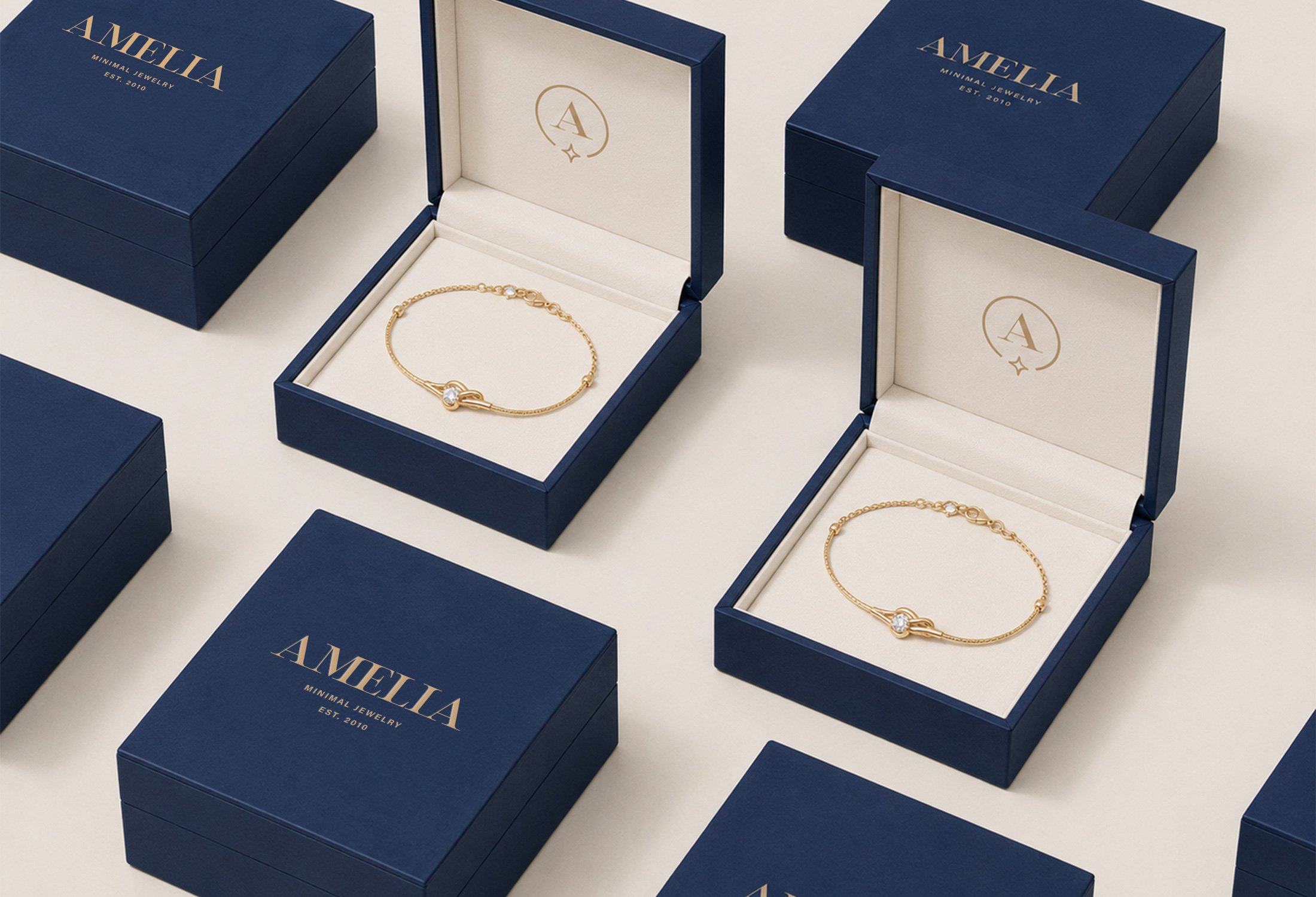
Subtle design details inspired by the precision and delicacy of fine jewelry add depth across the identity. The packaging and printed materials were designed to feel equally considered, creating a polished experience that supports the perceived value of each piece.
The Result
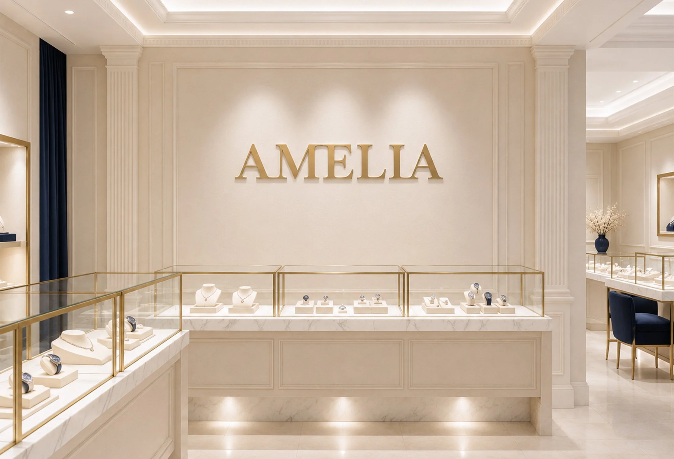
The completed identity positions Amelia as an elegant and modern jewelry brand with a clear, cohesive presence. It creates a refined foundation for presenting the collection, elevating the unboxing experience, and building recognition across retail, packaging and future brand growth.