Teraluxe
The Story
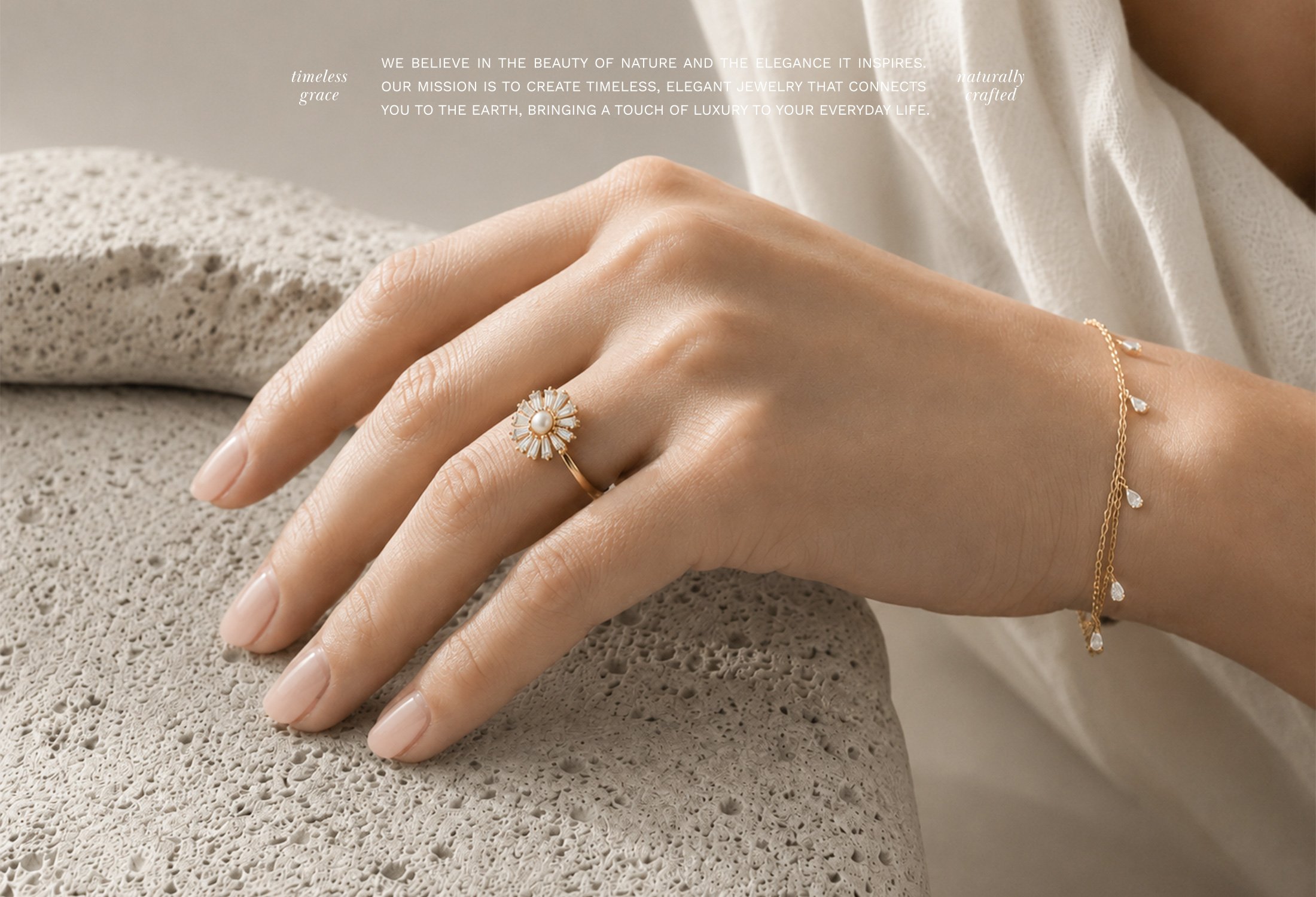
Teraluxe is a jewelry brand inspired by the natural beauty and richness of the earth. Its collection brings together organic forms, thoughtful craftsmanship, and timeless pieces designed to feel both distinctive and easy to wear. The brand needed an identity and packaging system that could reflect this connection to nature while creating a warm, elevated presence within the jewelry market.
The Challenge
The challenge was to communicate an earthy point of view without making the brand feel rustic or overly casual. Teraluxe needed to feel grounded and inviting while still expressing the quality, elegance and perceived value of the jewelry. The identity also had to translate naturally across packaging and customer touchpoints, creating a cohesive experience around each piece.
The Creative Direction
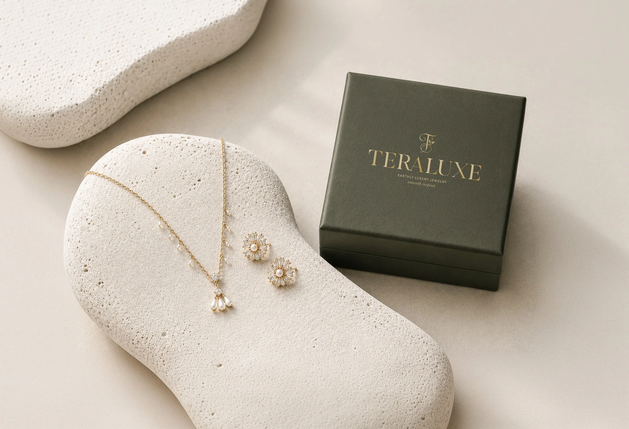
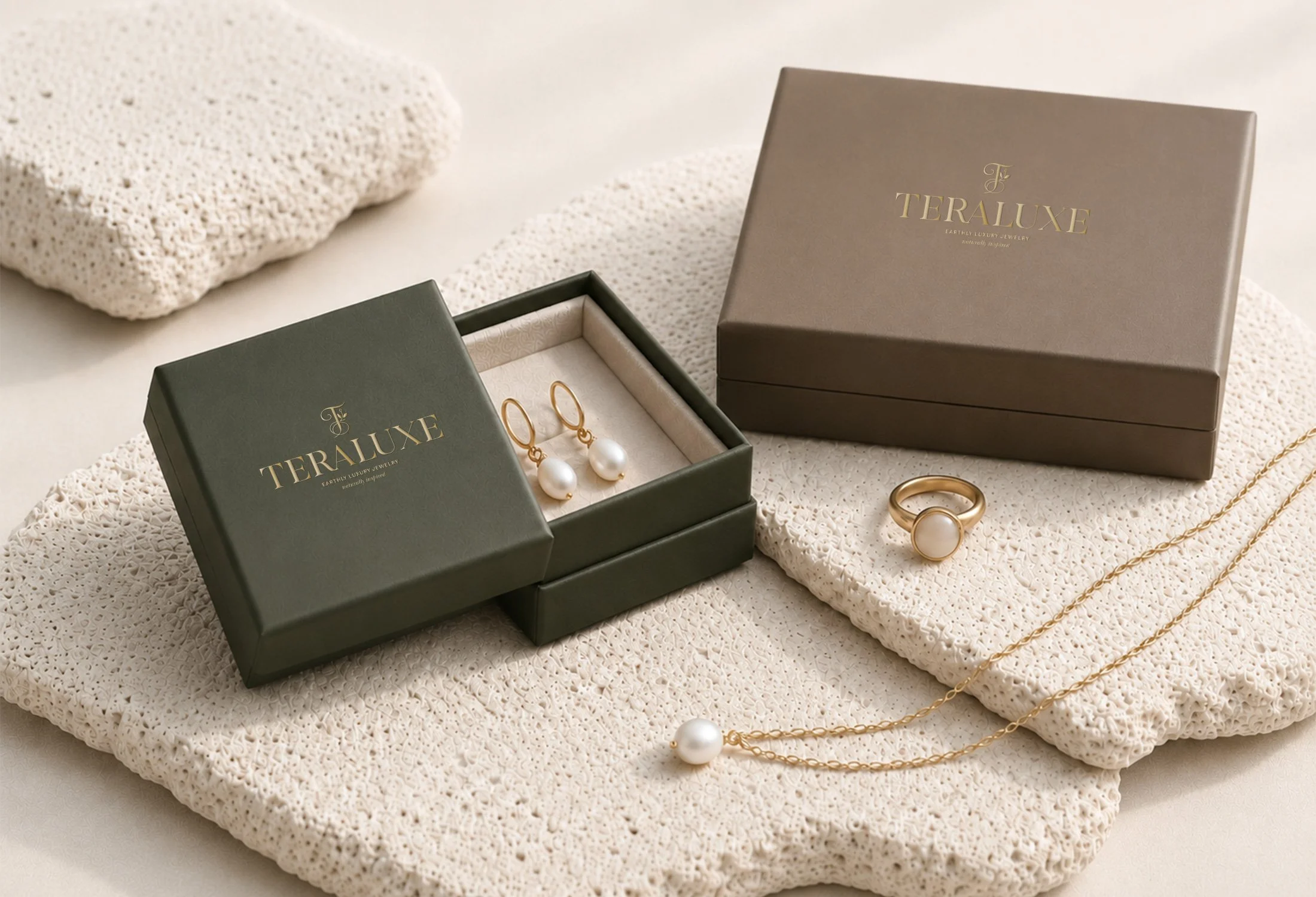
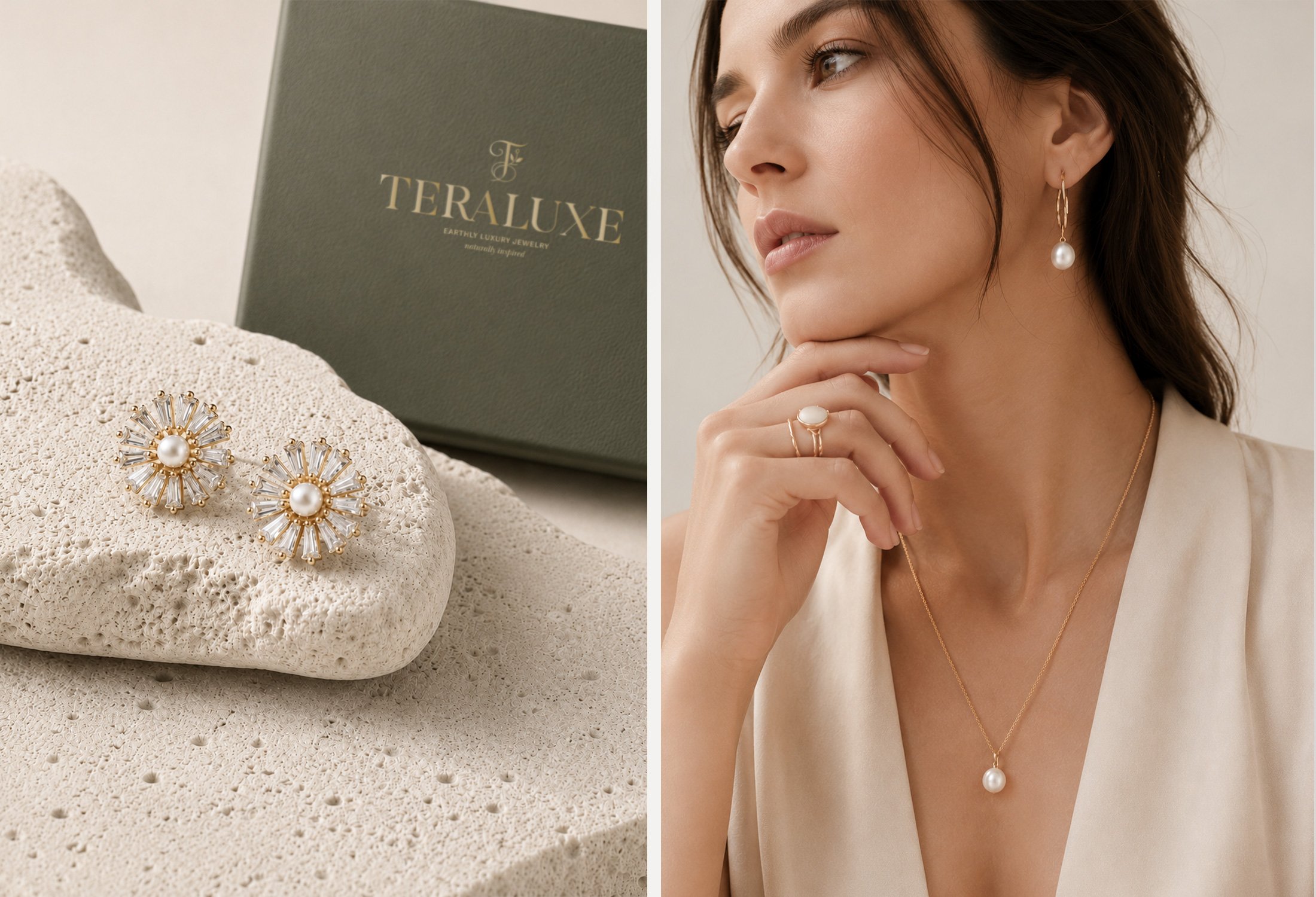
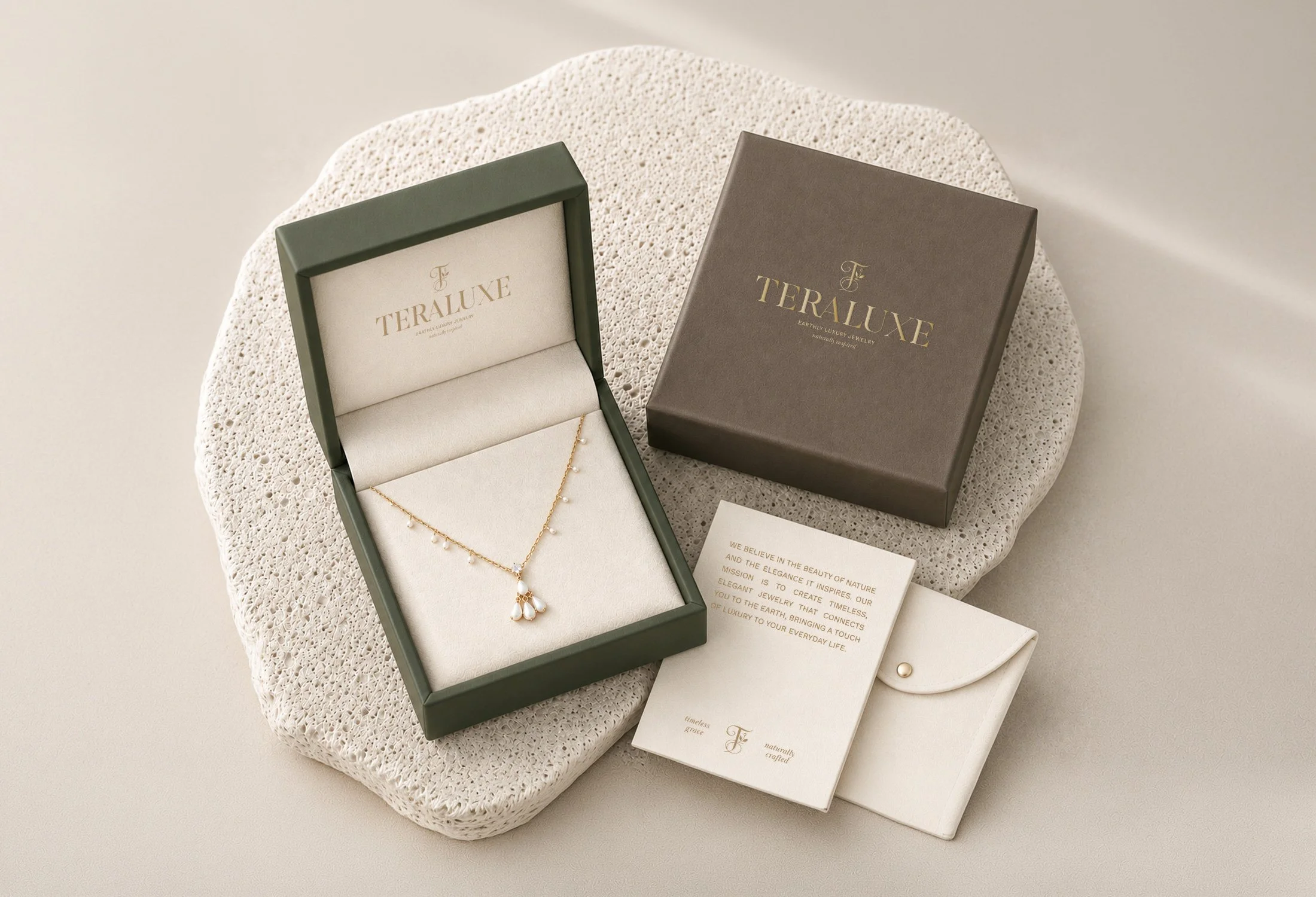
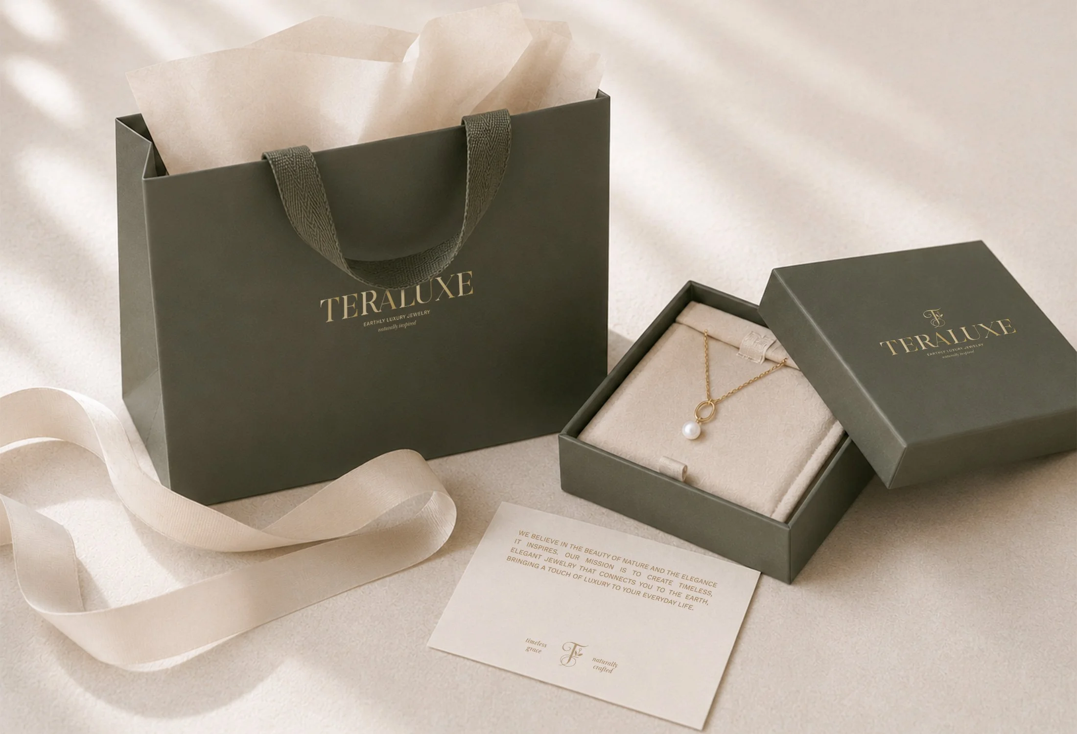
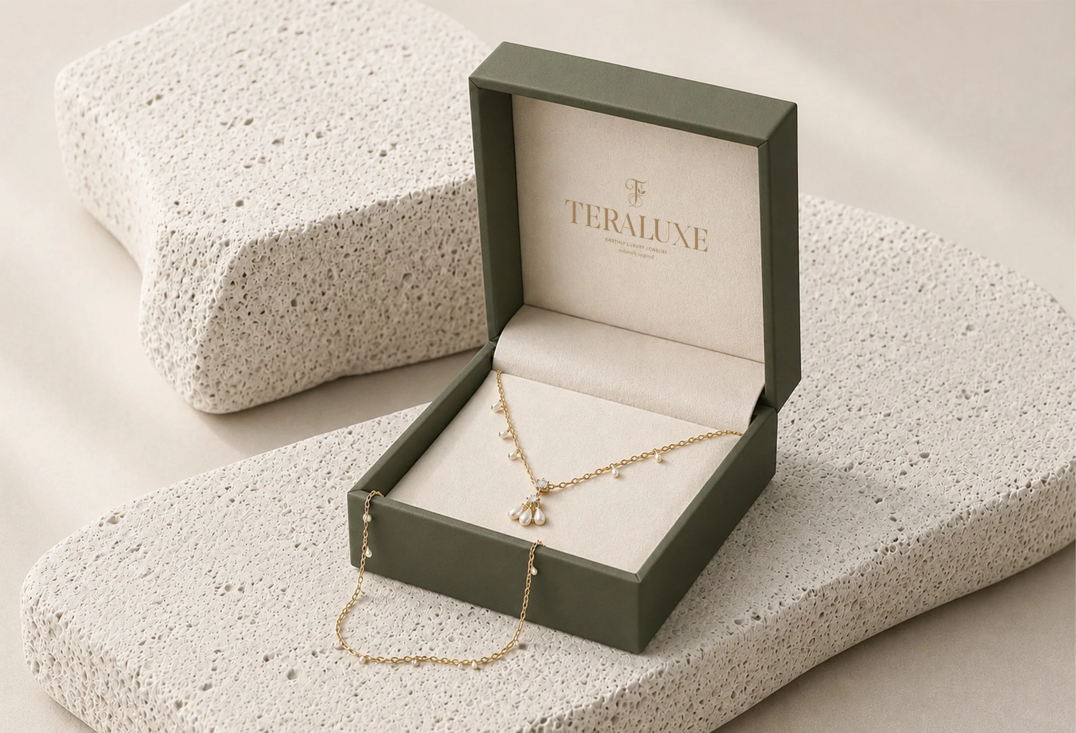
The visual identity was shaped around organic beauty, warmth and understated luxury. A rich olive green anchors the color palette, giving the brand a distinctive connection to nature while creating a cozy and sophisticated atmosphere.
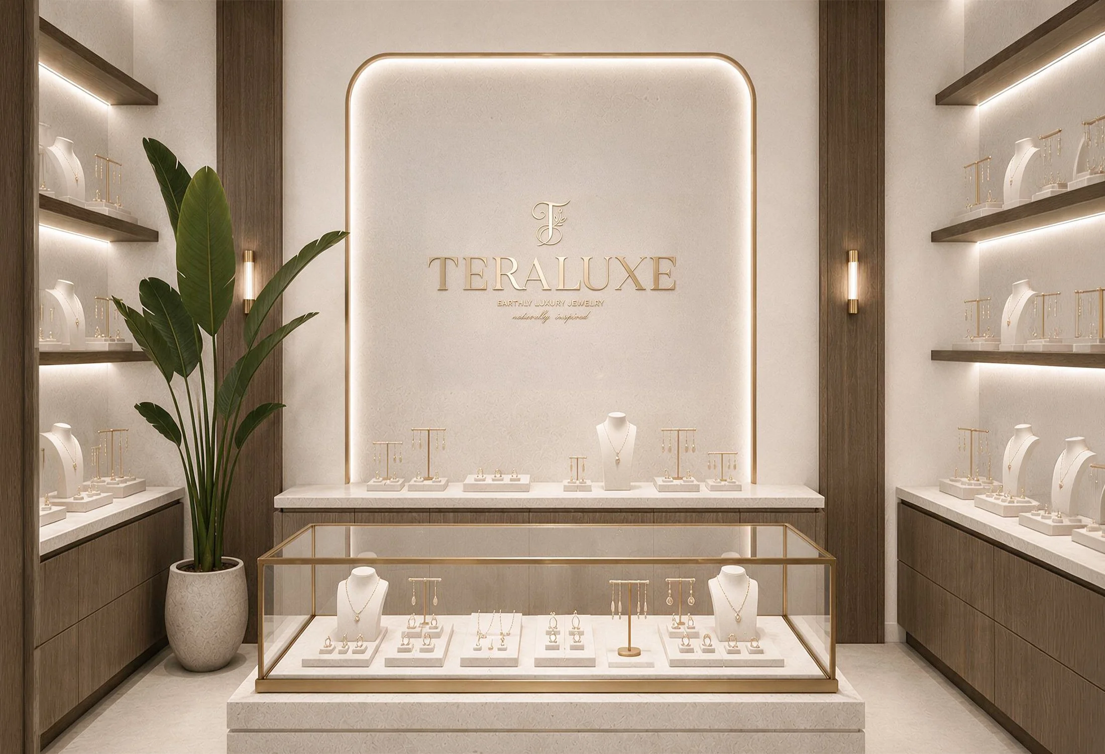
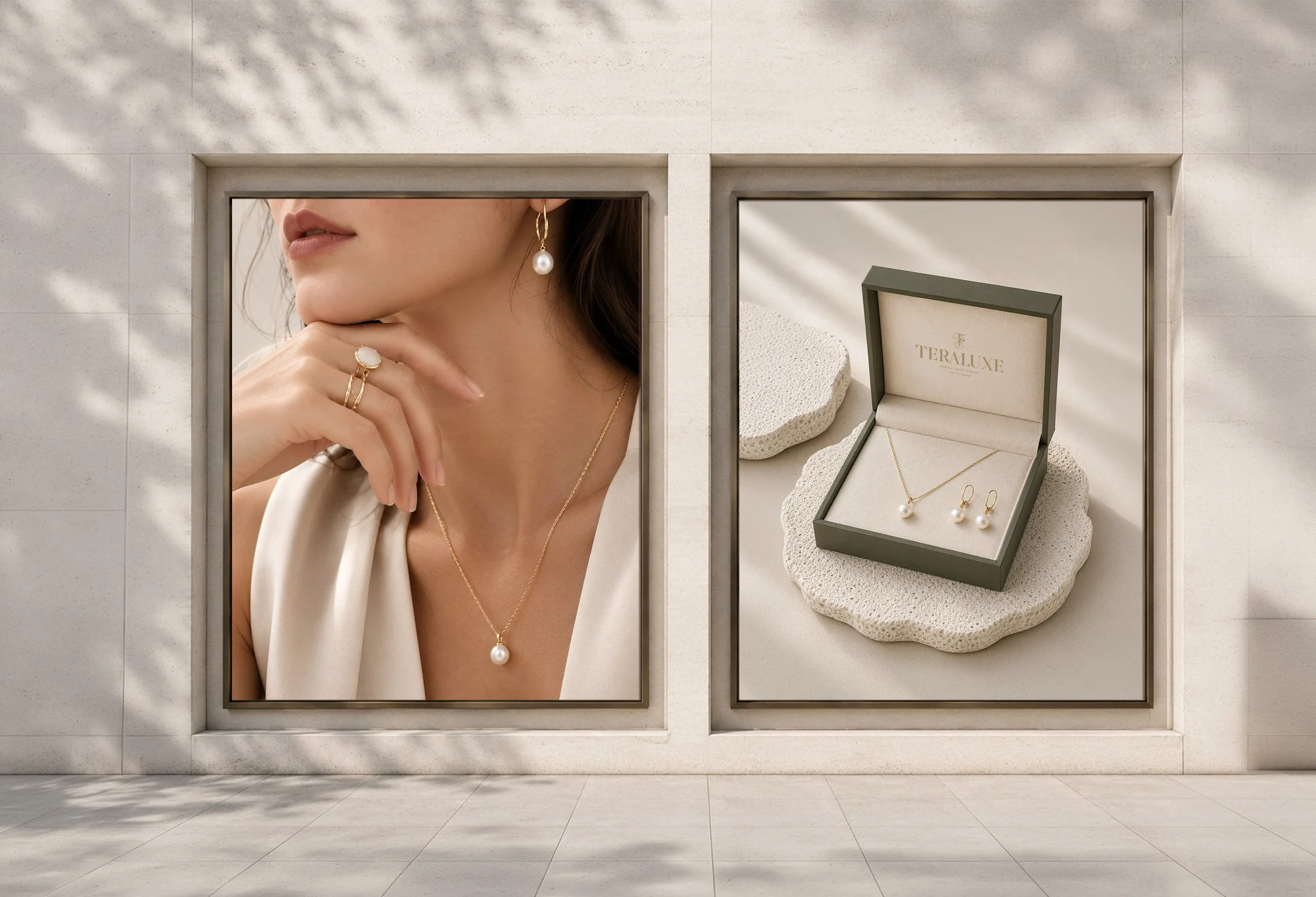
Earthy supporting tones, refined typography and restrained compositions balance softness with polish. Across the jewelry packaging, these elements create an intimate and considered experience that reflects the craftsmanship and natural inspiration behind the collection.
The Result
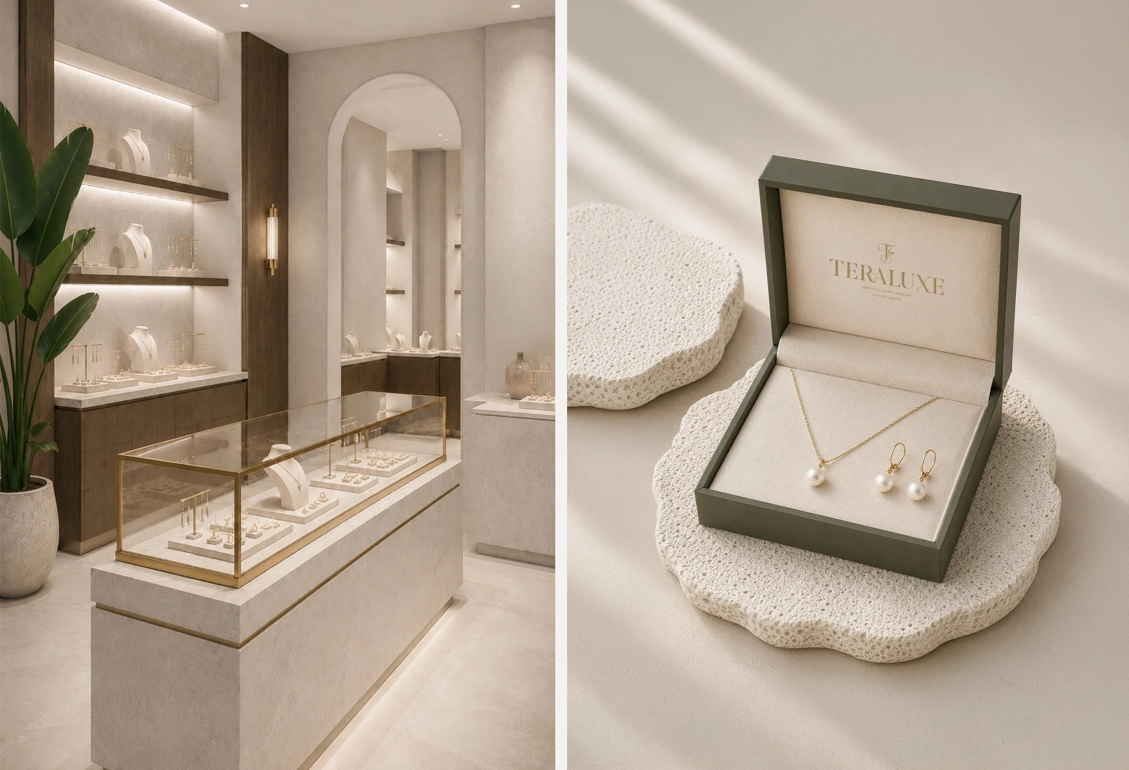
The completed identity positions Teraluxe as a refined, nature inspired jewelry brand with a warm and recognizable presence. It provides a cohesive foundation for presenting the collection, elevating the unboxing experience, and building consistency across packaging, retail and future product releases.