Willowen
The Story
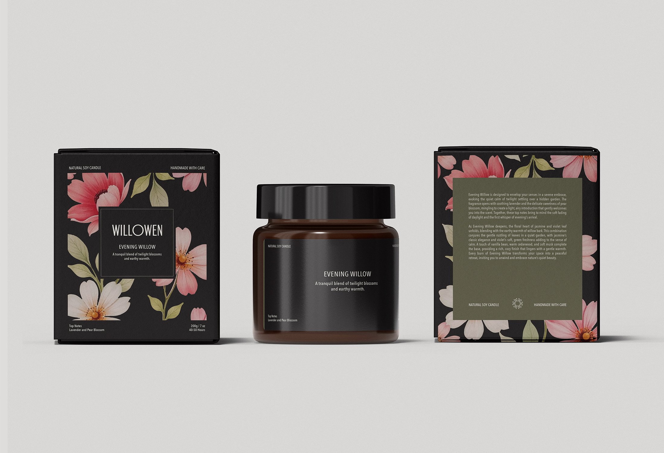
Willowen is a candle brand inspired by the calm and beauty of nature. Drawing from serene gardens, soft florals, and earthy tones, the brand was created to transform everyday spaces into moments of quiet retreat.
The goal was to develop a brand identity and packaging system that felt elegant, natural, and inviting, reflecting the sensory experience of the candles themselves.
THE SOLUTION
The visual identity combines minimal design with subtle botanical inspiration to capture Willowen’s sense of calm and refinement.
A palette of soft greens, blush tones, and warm amber reflects the brand’s connection to nature, while metallic accents introduce a modern touch of understated luxury. Elegant serif typography paired with clean sans-serif elements balances sophistication with approachability.
The packaging system extends across candle jars, labels, and outer packaging, creating a cohesive and recognizable brand experience that feels both elevated and serene.
The Scope
Brand Identity, Packaging Design